Let’s explore the process of creating a print. Using our “From Rio with Love” print as an example, you’ll be able to follow along with every step, from the initial concept to the final product.
Stages We Will Cover:
- Research / Briefing
- Concept
- Development – Idea Flow
- Finalization
Stage 01 – RESEARCH
First, we need to consider the theme that will guide the creation: in this case, the cultural heritage of Rio. Once the theme for your print is decided, it’s time to start researching to understand, explore, and develop the concept for the print.
How?
By asking questions, searching online, visiting places, and reading books. Everything that nourishes your ideas and sparks creativity. From there, we begin an idea mining process, extracting concepts to tell this story through our print. So let’s dive into the research, and then we can start the creative process.
So, what is cultural heritage?
Cultural heritage is a collection of tangible or intangible assets that represent the identity, memory, and customs of a people. These assets are essential for preserving the culture and history of a region, city, or country.
The concept is tied to what is passed down as heritage across generations, referring to a shared inheritance among citizens, which carries an element of a society’s identity.
Material Cultural Heritage: This includes physical assets, such as monuments, artworks, cities, archaeological sites, natural parks, and more.
Intangible Cultural Heritage: These are non-physical assets, encompassing practices and areas of social life expressed through knowledge, crafts, ways of doing things; celebrations; dances, forms of theatrical, plastic, musical, or playful expressions.
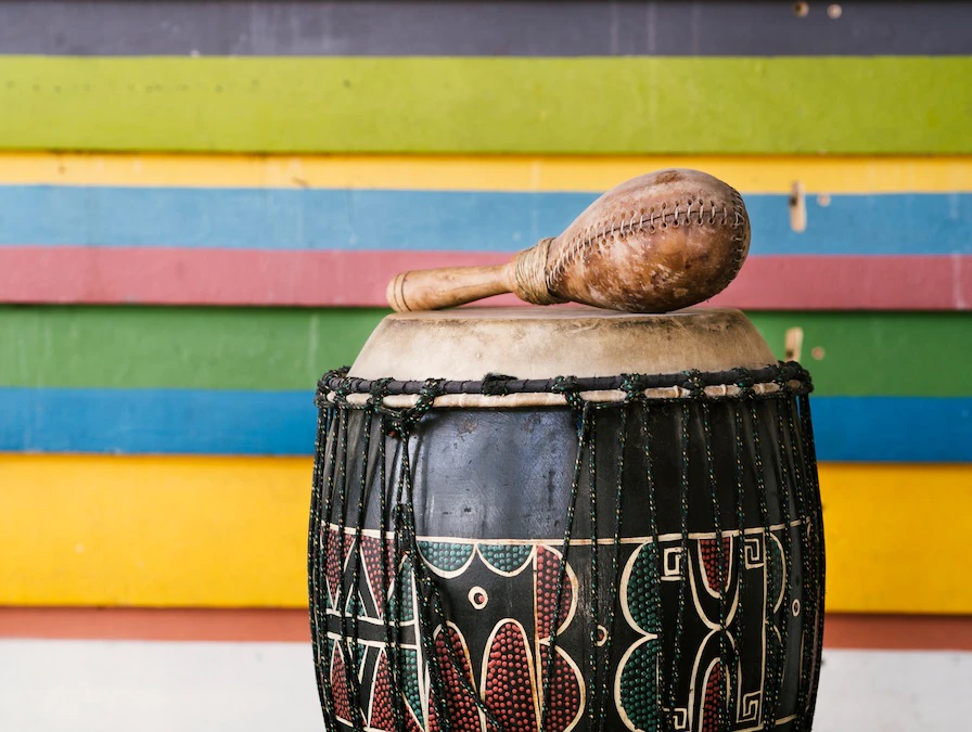
Now that we understand what cultural heritage is, let’s research Rio’s cultural heritage assets, as this is our central theme for creating the print. Some of Rio’s cultural heritage assets include: the Lapa Arches, the Municipal Theater, capoeira, Carnival, Flamengo’s fanbase, the Copacabana boardwalk, among many others.
In 2012, the city of Rio de Janeiro itself was recognized by UNESCO as a World Heritage Site for its Cultural Urban Landscape, becoming the first urban area in the world to receive this title.
Rio has an urban landscape that blends with nature, creating a unique street culture, with vast open spaces, gardens, and a coastline that are integral to the life of its residents. The people of Rio embody this blend of urban environment and natural surroundings, shaped by a topography that intensifies the connection between the sea and the hills.
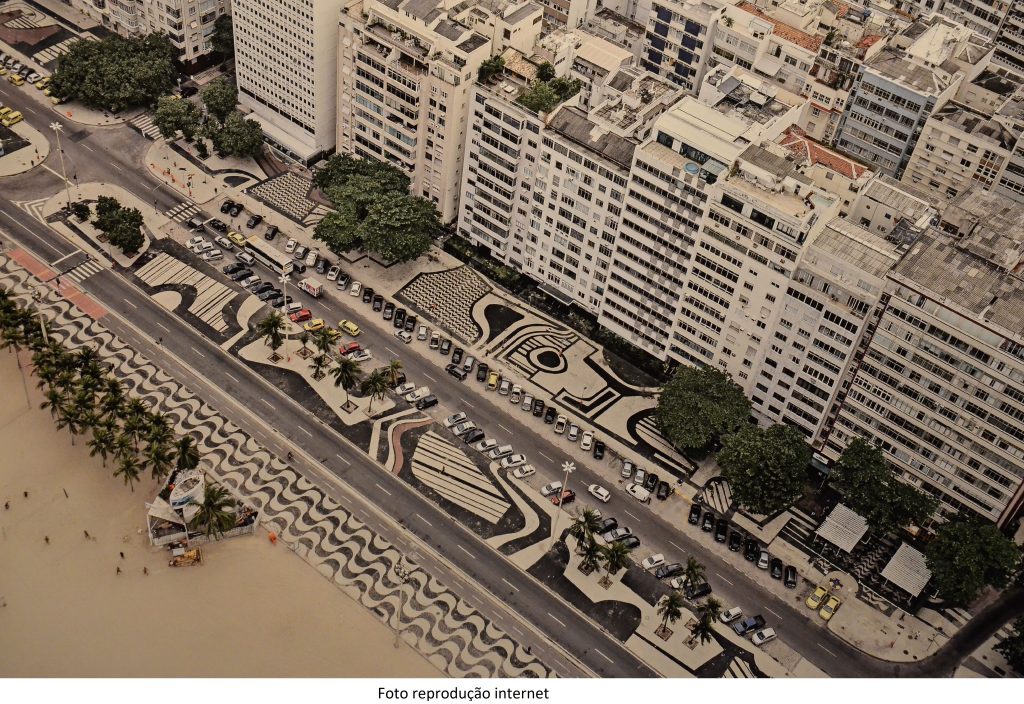
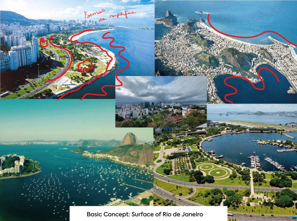
I chose one of Rio’s most famous landmarks as a reference for our project: the Copacabana boardwalk.
Perhaps you’ve strolled along Copacabana’s shore without fully noticing this vast abstract mosaic. Its fragmented design encourages a fluid, free movement, offering the possibility of various rhythms and directions.
This mosaic was designed by the landscape architect Roberto Burle Marx, the figure who introduced modernist landscaping to Brazil.
Burle Marx drew inspiration from nature, incorporating sinuous and organic shapes into his work. He envisioned his landscape plans as abstract canvases, creating pathways and secluded areas, and using vegetation to create large swathes of color. His work was influenced by avant-garde movements like abstract art, concretism, and constructivism.
Caption: Project Design, Copacabana Boardwalk, 1970.
Analyzing Burle Marx’s project, we can observe the preservation of the traditional Portuguese stone pavements, combined with a subtle reference to indigenous art motifs. This evokes memories of our history and roots, creating a meaningful connection and an excellent aesthetic reference for our design.
Briefing – Creation Guide
A briefing is a document we use to gather as much information as possible about a client’s project. Through it, we can understand the brand’s needs and goals. It serves as our guide to finding the solution the client requires.
For this particular project, there was more creative freedom, so the briefing was simplified and concise, providing just enough direction for our work.
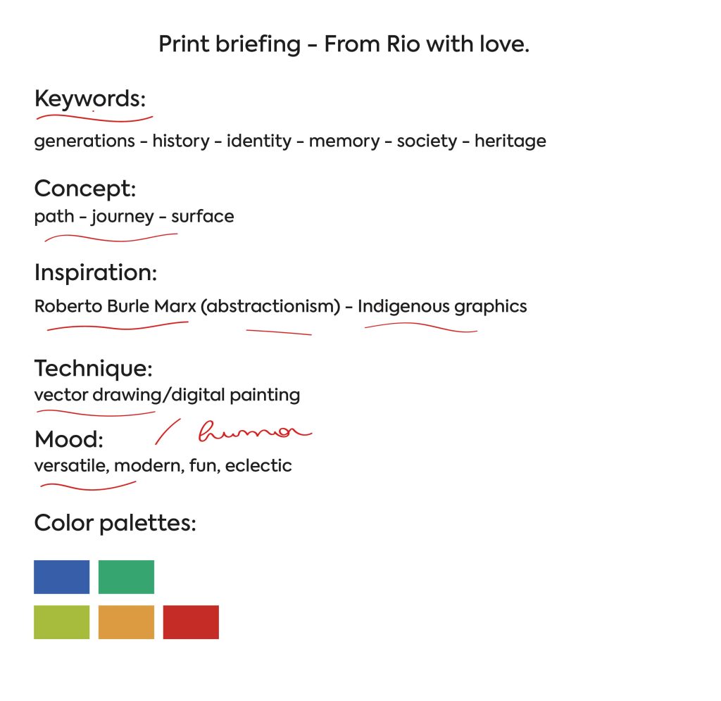
The name “Do Rio com amor” beautifully encapsulates the essence of Rio’s culture and history. With our keywords, concept, inspiration, chosen technique, and mood all set through our research, we have a solid foundation to bring this print to life. This cohesive approach will ensure the final design is both meaningful and visually captivating.
Step 02 – CONCEPT
Now that we’ve conducted research and have a better understanding of the theme we’re exploring, it’s time to start brainstorming ideas.
How will we do this?
We’ll look for key words within our research to guide the creation of our concept. From everything we’ve seen during the research phase, I was able to identify 7 key words that will represent the concept as we begin the creative process. They are:
- Society
- Culture
- Heritage
- History
- Generations
- Memory
- Identity
Have you ever imagined how many stories have unfolded right beneath our feet? How many things are still here, communicating with us, reminding us of a past and a cultural wealth that we carry?
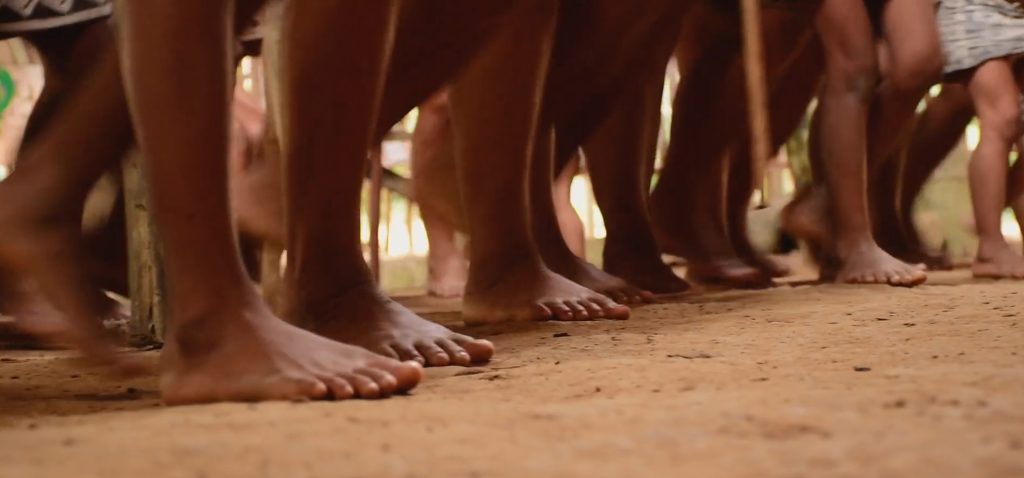
Where we step, thousands of other people have also walked, and when I think of history, I think of paths, journeys, feet, ground, surface… because it’s a journey we live, and memories are created along the way.
By combining all the words from our research, I realized that they all have something in common and point me toward the concept of:
JOURNEY – PATH – SURFACE
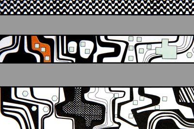
The fact that indigenous art is inspired by the surfaces of nature, like animal skins for example, also inspired me to use the surface of the city of Rio de Janeiro as the foundation for our design. So, we’ll tell its story by drawing its surfaces with abstract shapes, using the very topography of our cultural heritage, the city of Rio, as our reference.
Step 03 – DEVELOPMENT
Creating the Moodboard
Now that we have our concept in place, it’s time to start sketching ideas. To guide the creation of our design, we’ll gather images for reference.
Since we decided to use the topography of Rio de Janeiro as a base, I searched for aerial views of the city to use as visual references. Additionally, we’ll look for images of indigenous art graphics and some abstract paintings by Burle Marx, as we’ll also draw inspiration from his work in abstraction to influence the aesthetic of our project.
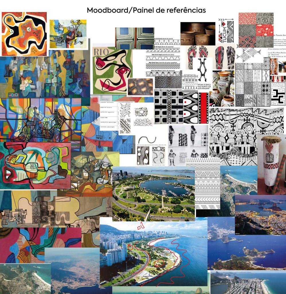
After collecting the images to use as references for our design, we put together the moodboard, which will serve as a guide and reference throughout the creation process. It helps us visualize the project idea more clearly.
Idea Flow on Paper
In this stage, we do a kind of brainstorming, sketching out shapes that can represent each detail of the surface and the story we want to tell. This is where we begin to explore different possibilities for how the elements will come together visually.
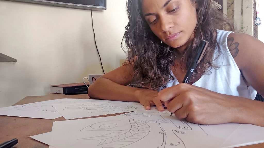
This is the part where we get our hands dirty! =)
We start by scribbling anything that comes to mind, without overthinking, just letting the ideas flow onto the paper, but always keeping our guide in mind. We know we’re going to use organic shapes, lines, and graphic elements, so we let things flow, while staying true to the concept of the design.
I did a lot of tests on paper, just to let the ideas flow. I really enjoy having that hands-on experience when possible. However, for practicality, this design will ultimately be created using vector techniques, which allows us to draw directly on the computer.
Once I had defined the shapes that made sense for the design, I moved on to creating the final forms on the computer, and from there, we could start building the composition of the print.
Creating the Composition
The composition of a print is one of the most crucial elements in the creative process, as it defines how shapes and graphic elements are arranged in space. In an abstract print like this one, the composition can be more free and intuitive, allowing for the exploration of various shapes and patterns without the need to follow a rigid logic. However, it’s essential to consider repetition (rapport) and how the shapes will align and interact to create a continuous pattern.
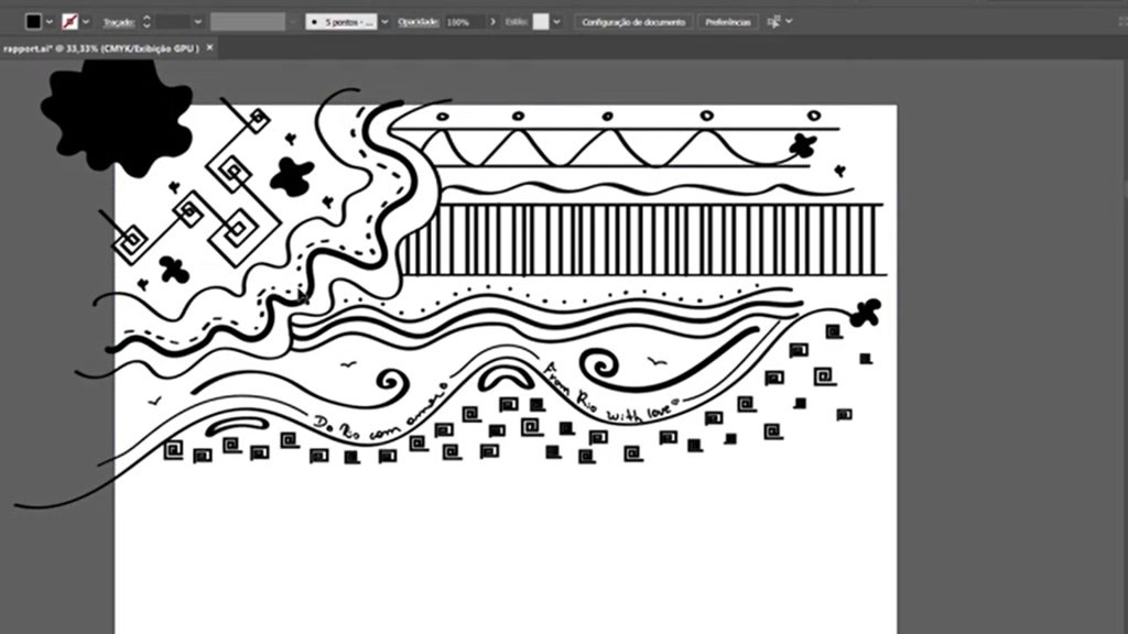
Building rapport in abstract prints can be challenging because the shapes don’t follow a fixed pattern, which can make it harder to achieve a perfect alignment. That said, the choice of the final product where the print will be applied can influence how noticeable this alignment is. In products with cuts or smaller pieces, the impact of repetition and alignment may be less perceptible.
Finally, it’s important to consider the final product where the print will be applied. Doing so helps us clearly define how the print will be viewed and ensures that both the print and the overall aesthetic of the product are enhanced.
Step 04 – FINALIZATION
Colorization and Finalization
During the research and concept development phase, we defined the color palette that would best represent the essence of the print. I chose vibrant colors that capture the energy and spirit of the carioca people. The choice of colors is crucial for conveying the message and story we want to tell through the print, as each shade carries emotional and symbolic meaning that enhances the visual communication.
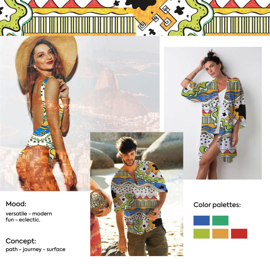
After finalizing the colorization and rapport, we moved on to the application phase, brainstorming the types of products the print could be applied to. We then prepared a presentation with the ideas and final files, ready for printing and production on the final products.